There are many people who take pleasure in drinking wine, but have no idea about its origin and history, even though wine and drinking wine are well embedded in the philosophy of every country in the world.
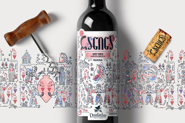
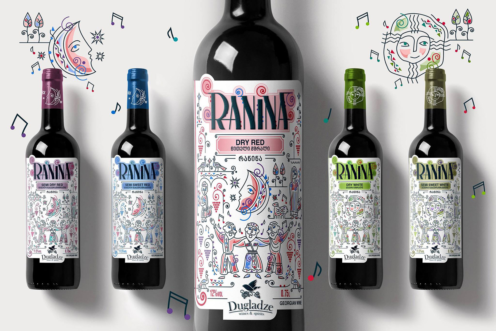
Wine interrogates, absolves, intoxicates and invigorates, but in any case affects us. Whether the colour is gold or purple, it contains the strength of the earth and all the light of the summer together with the greatest of anxious care. When I saw Ranina’s design, it was clear to me which country and people it was about.
The saying goes that after the Creation, God distributed the various peoples around the world, but the Georgians were partying their time away and arrived late for their allocation, so, for want of anything else, the Lord was forced to give them the most beautiful land which he had reserved for himself.
The designers drew their inspiration for the brand name from Georgian songs where the Ranina refrain crops up rather often, especially connected to wine, feasts and a good atmosphere. Whoever has been fortunate to come into contact with a real tamada and twenty-course meal will know what I mean. For those who haven’t, I can only say that, in addition to the various courses, the wine really flows. Somehow, it feels as if Georgians are always able to find something to celebrate and this often ends in joyful bursts of singing.
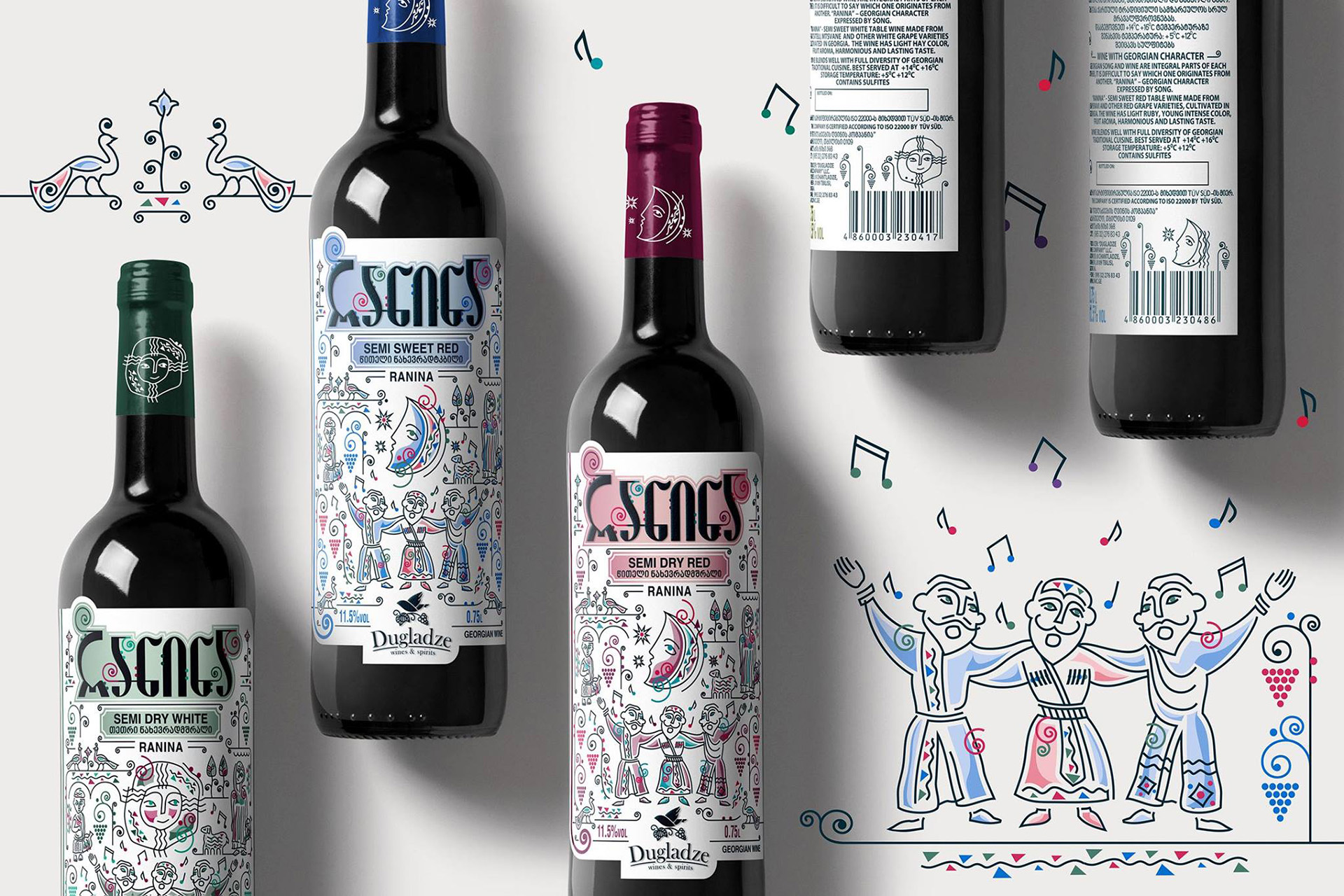
The characters featured on the label definitely reflect that feeling with merriment, in that it blends folklore visually with modern colour coding and also delivers a bit of a cultural impression. Looking at the whole range of the brand, I particularly liked the fact that the labels’ richness of detail merges into the background when viewed from a distance, so that your attention is diverted to the brand name with its coloured background.
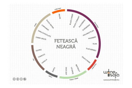
For anyone who would like a little more insight into Georgia, we have already published two articles which you can read (Georgia on my mind, Visiting the cradle of winemaking).
Designed by "branding.ge"