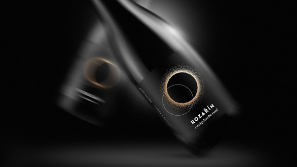
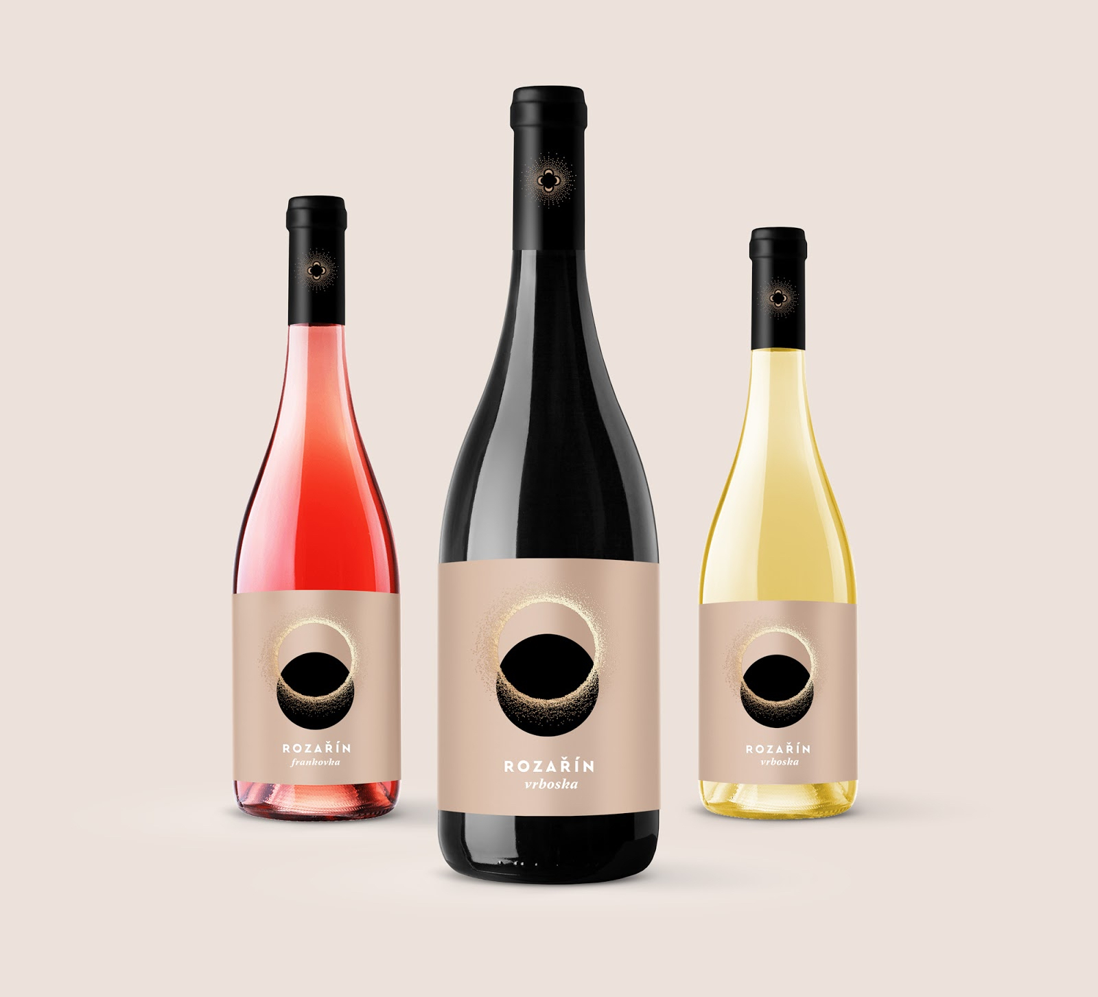
The regularity of nature cycles reminds us of connection with the soil, the landscape, and the universe. The Rozařín winery created two labels for their wines - the light one called Dawn and the dark one called Twilight. The winemaker presents new wines every summer and winter solstice. The sun rays shining in the label are processed by two shades of golden hot foil stamping. The logo has a fine embossed relief. The label design is underlined by the raw natural material Cotton.
What's Unique?
The re-designed labels found the story in the far history of the winery which has got its name from the extinct village Rozařín. It combines the name of Saint Rosalia and the glow in the Czech language. That's why the brand is inspired by pagans' relation to nature and sunlight cycles. The rose symbol was kept in the redesigned winery logo.
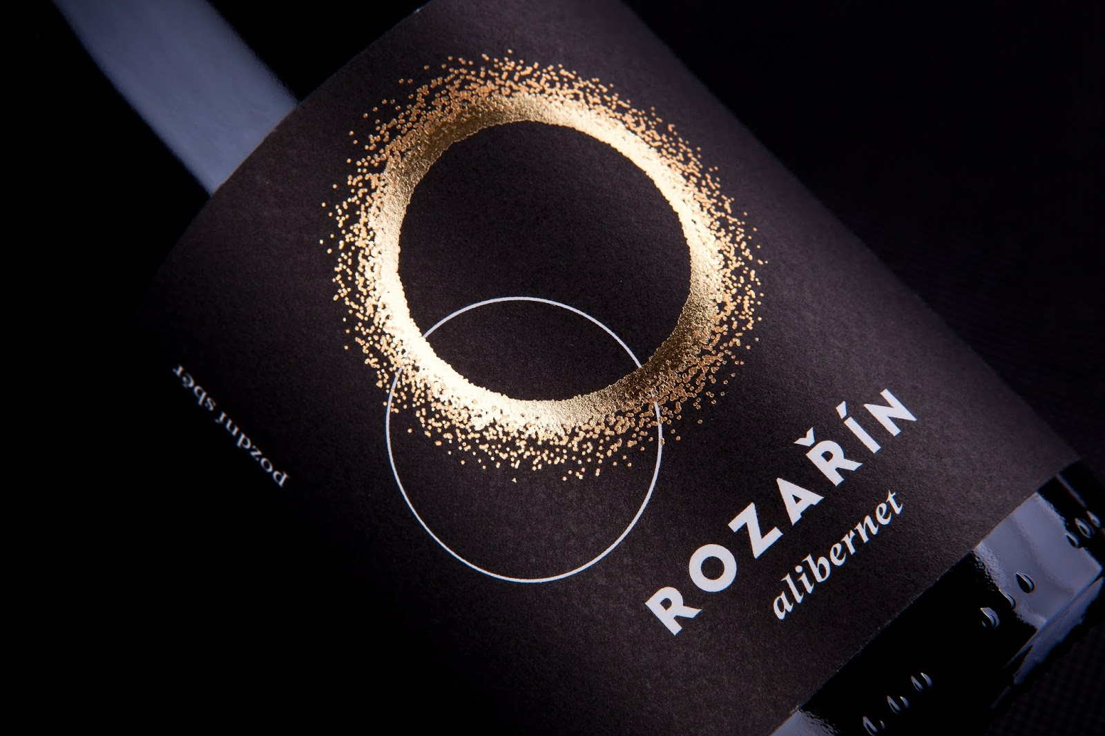
The unique effect of glow on the label is a result of long testing in production. We used the combination of two shades of golden hot foil stamping to reflect the sun rays.
Designed by David Gec
Via: Packaging of the World