Portraying philosophy through design.
Nachbil is a heritage vineyard from north-west Transylvania in Romania. It is one of just a few wine makers that removed all additives from the production process to bring out the natural tastes and flavors of the grapes. Their philosophy sees wine making as raw and natural. Even though this comes with unusual tastes and aromas that differ a lot from the ordinary, it offers each of their products a distinguished, independent personality.
They wanted the new product packaging to portray and support this philosophy.
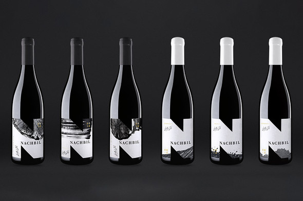
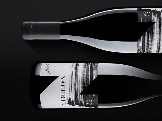
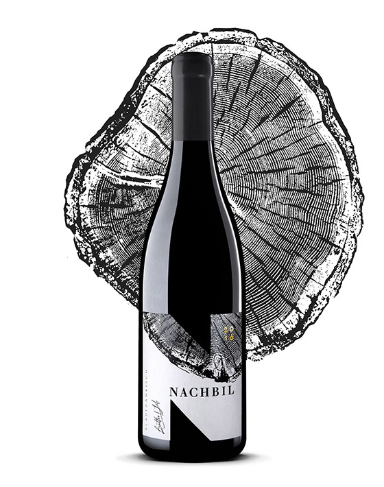
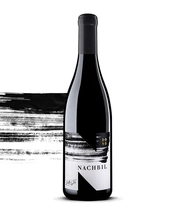
The elements imagined for the new labels represent different stages of the wine making process: a section of a maple tree from which the barrels are made, a leaf from the grapery, a section of the vineyard, the print of a brush as the human touch.
What's Unique?
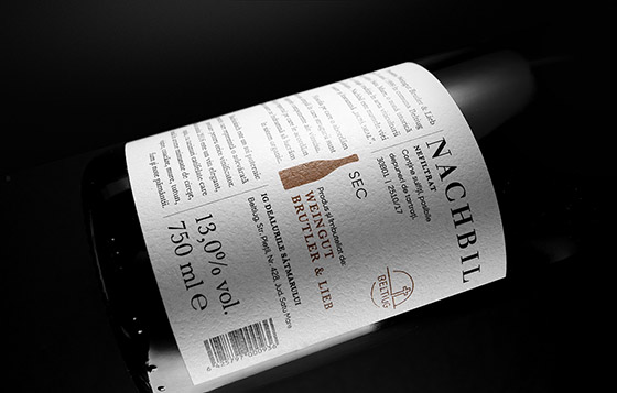
The label, which uses the letter „N” – from „natural” and „Nachbil” as a mask is designed to stand out on the shelf using a monochrome palette, golden foil and tactile/volumetric polish for a richer sensorial experience.
Designed by Peter Arpad
Via: Packaging of the World