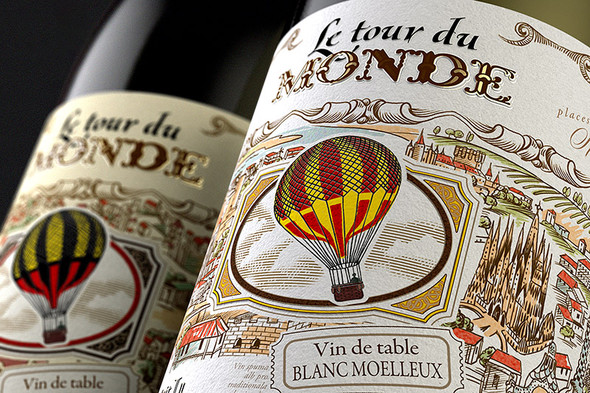
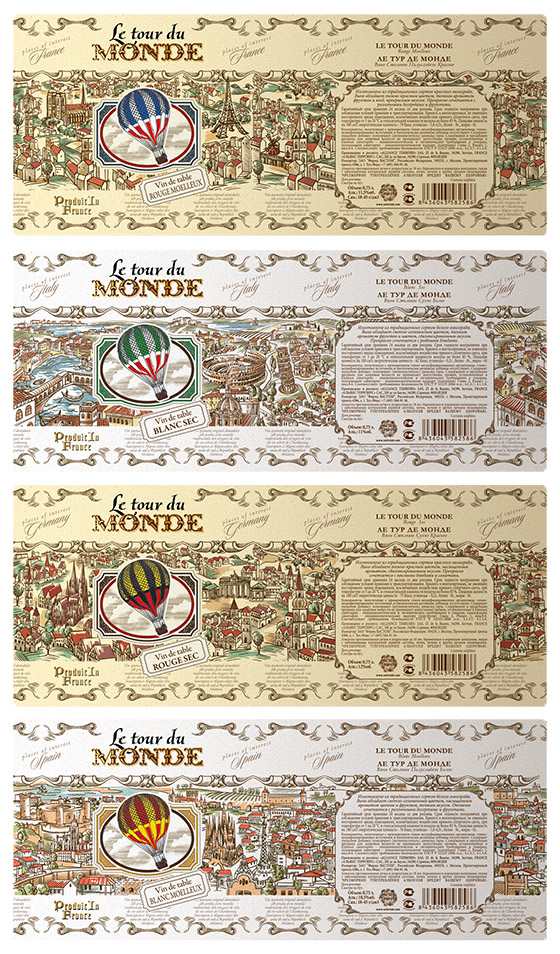
The base for this concept is the air balloon travel plot from the popular adventure novel Around the world in 80 days (Le tour du monde en quatre-vingts jours) by French author Jules Verne. Each product in the line is represented with a unique storyline, which reflects the main landmarks of the country (France, Germany, Spain and Italy) that the wine comes from, all depicted in a vintage style. The number of countries corresponds to the number of SKU in the product line.
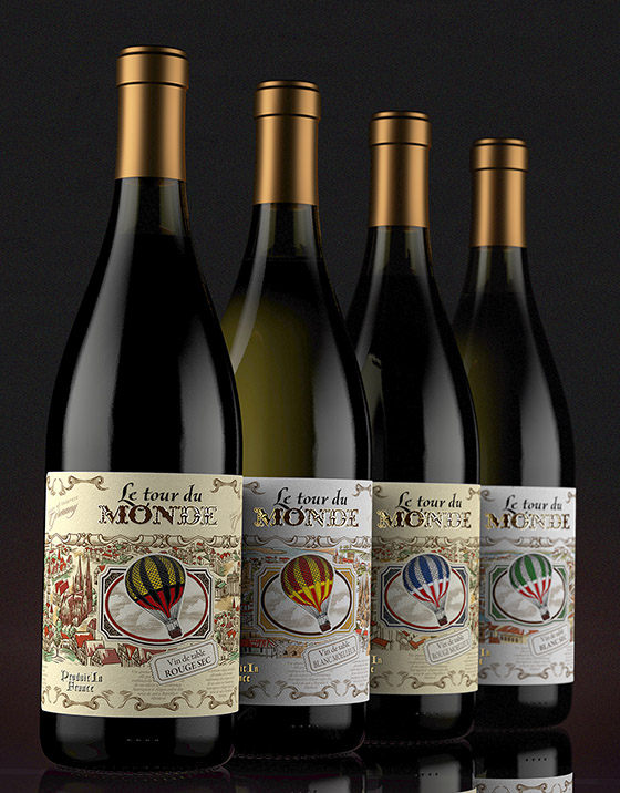
The main artistic challenge was creating a packing that would combine a vintage style with detailed depictions of various landmarks while not making the label look too busy from the visual standpoint. It was necessary to reach a balance between a potentially high quantity of elements and the label's overall harmony. A lot of work was done to achieve this goal. - Valerii Sumilov
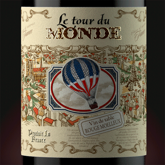
The design combines the classic spirit of Verne's novels in their aesthetics with the geographic classification of the wines themselves. The printing was carried out using high quality artistic paper, which allowed, in combination with various techniques, obtaining the best embodiment for the packing and providing the best sensations while handling the product near the product shelf. The label is glued around the bottle's entire circumference thus forming a continuous line.
This interesting, exclusive design is pleasant to look through in details while drinking the wine from this collection.
Designed by shumilovedesign