Many are convinced that connection between quality wine and nature can only be physically represented using paper labels and classic typography. However, I am positive that if someone dares to be different and show a new direction, for instance, to the appearance of wine, dares to leave behind old traditions and create completely new ones; even the idea itself means real progress. What is more, if we study closely the wines on the shelves of shopping centres and stores, we can clearly see that there is significant room for improvement.
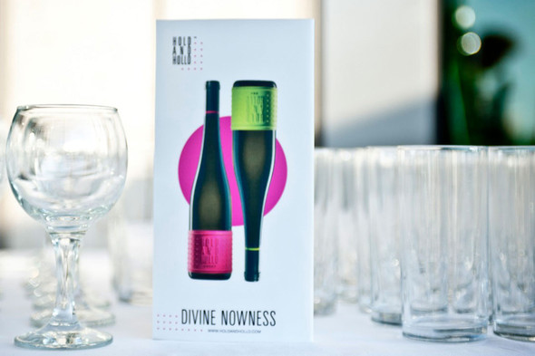
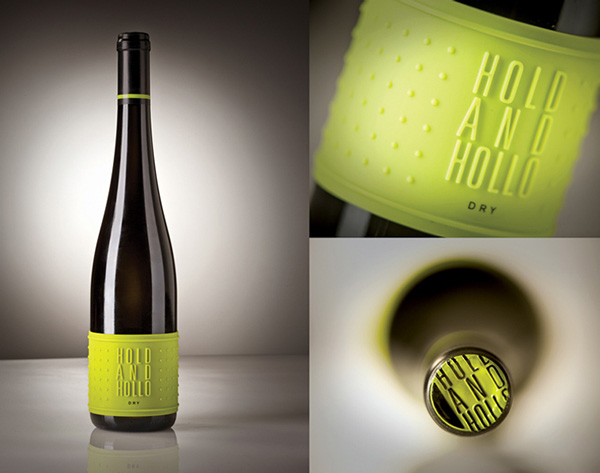
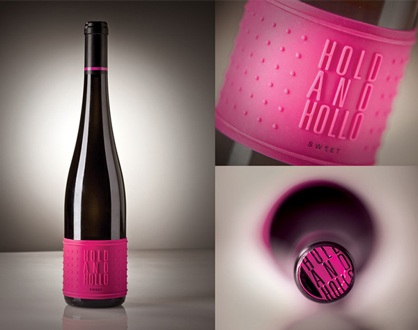
There is a really lovely story behind the brand-creation. When the Moonvalley vineyard started its operation, they attended several kinds of exhibitions and faced the problem of paper labels soaking off the bottles in buckets of ice or coolers filled with water. The really visible, very practical and modern, neon silicon label was created as an answer to this problem. This label does not soak but can be peeled off the bottle. Besides, during the creation of HOLD AND HOLLO brand, it was highlighted that the Tokaj wines – which are no longer about the barrels or intensive oxidation –should get closer to the consumers.
Innovation is a quest for perfection. It’s our philosophy to make no compromises, to devote ourselves to the care of this stunning, unique terroir with the tenderness it deserves, to be steadfast in creating a collection of wines that capture some of the beauty we have found on this extraordinary piece of land. It’s not just a philosophy. It’s our passion.
Winemakers would like to arouse consumers’’ curiosity via the packaging but as for the contents, they stick to the same style and quality year by year; only the ratio of different grapes change. Though the concept was developed years ago, I have not come across anything similar ever since, and I hope others will also be encouraged and motivated to think over the image of their products and follow this great example.
Designed by Örsi Juhász