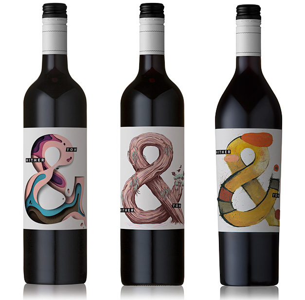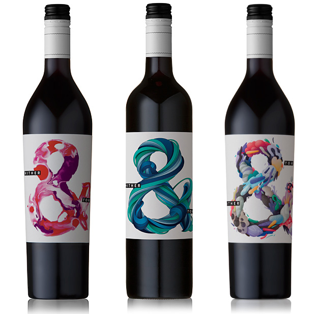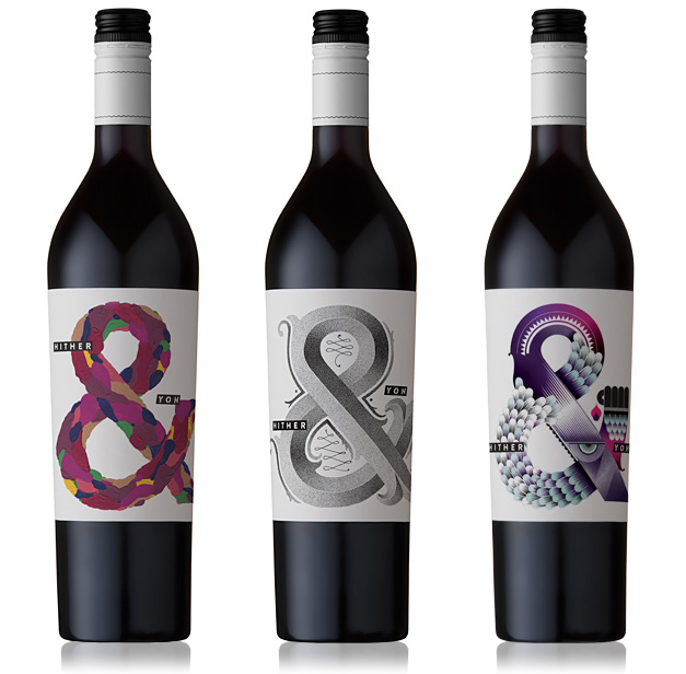
A brand that pays at least as much attention to product packaging as it directs towards the making of its different vintages. I’d like to introduce here one such a winery that doesn’t have two identical wine labels and whose designers from all around the world change every year too.
Every year, Mother Nature challenges us to a game of hide & seek ~ The fun begins as we search hither & yon through our medley of vineyards scattered high & low across McLaren Vale’s diverse majesty ~ Our quest ~ to discover that secret place each vintage, where the variety & vineyard environment have conjured something above & beyond expectations ~ Then we respect this prized fruit by allowing it to express itself, pure & natural. - Richard & Malcolm Leask
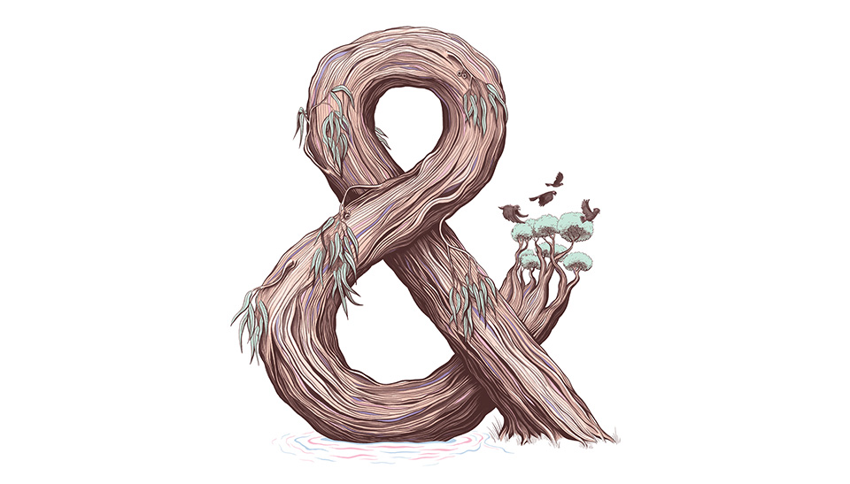
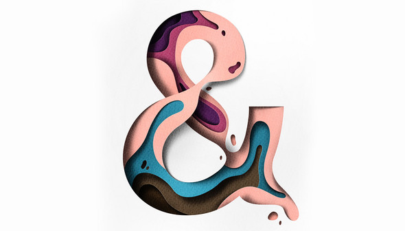
Many people see that they are addressing new client bases with these coloured letters. The letters, like graphic elements sweeping everything away, then seem a little tired. All in vain, everything only works if there is some thought behind it. As I see it, the unique ampersand on the labels represents the current harvest and the tasting notes of the varieties, together with the kind of playfulness that also reflects the philosophy of the creators.
We hope you enjoy the journey with us by sharing our wine with food & friends, whether you’re at hearth & home or hither & yon. - Cheers, The Brothers Leask