The group of friends shared a common interest in fine wines and a curiosity about different cultures and flavours until, after having gained sufficient inspiration and experience, they embarked on wine making in 2012. They have managed to realize their dream in Neustadt, Germany (Rhineland-Palatinate), a town rightly known for its wine route and, of course, the Rieslings produced there. Their common goal is to make wines that represent both the unique character of the terroir and the excellent quality.
The origin defines a wine, but only the winemaker can form its character.
To broaden their knowledge they have ever since been researching the relationship of nature and terroir in wines, looking for new experiences and inspiration and monitoring trends. This is also how the brand name was born; they had been quasi hunting the perfect wine.
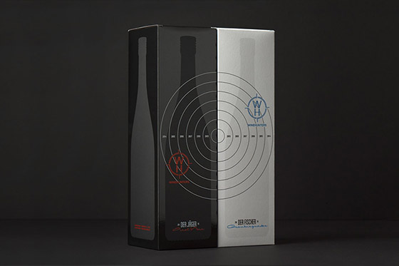
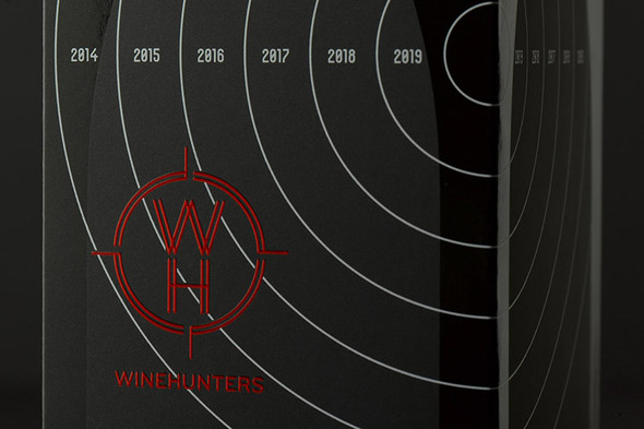
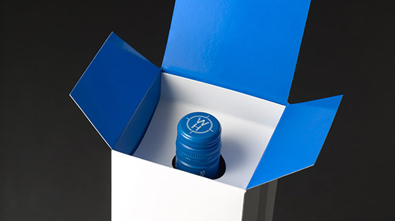
An analogy to hunting typically comes to mind when referring to winehunters and so it was natural for a stylised target to be developed as a key element of the brand's corporate design, for it symbolises the accurate pursuit of perfection, while individualised logo colours increase the brand's overall flexibility across diverse media applications.
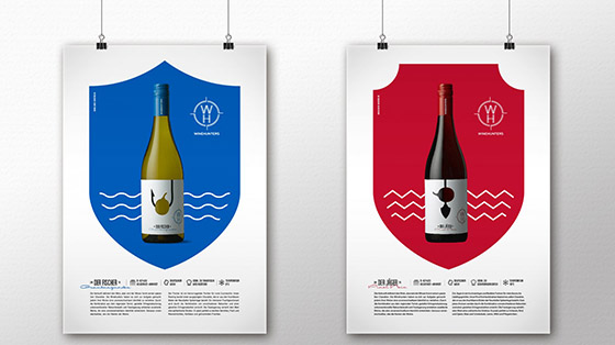
The wines themselves equally embrace the hunting theme: The Pinot Noir is an ideal accompaniment to red meat and is robustly called "Der Jäger" (The Hunter) while the white Pinot Gris is a perfect companion to seafood and so bears the name "Der Fischer" (The Fisherman). Each grape variety is represented by an intuitively understandable image that cleverly illustrates both the name and provenance of the wine.
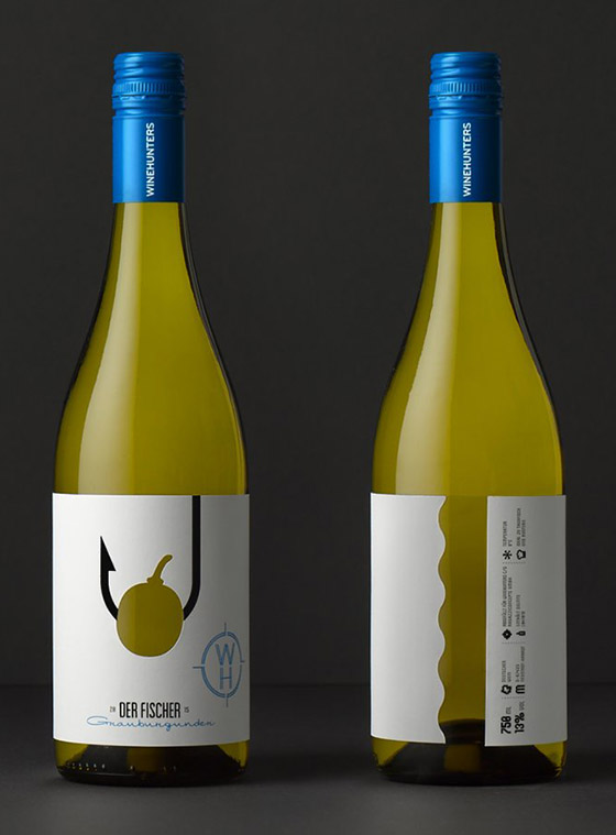
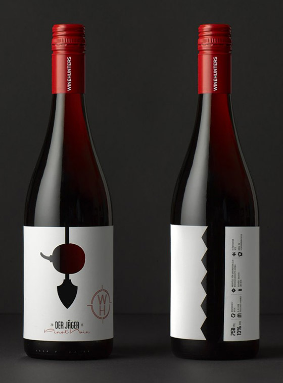
The grape is always the center of attention. It is cut out of the label so that the bottle shines through. This gives the grape its color. Depending on the flavor and terroir the grape is being held by a different hunting weapon such as an arrow or a hook.
Awarded with Red Dot 2016 – Packaging Design
Designed by Peter Schmidt Group