Sicilian viticulture is undergoing major regeneration, which is well characterised by the fact that the wines originating from the island are categorised under 22 geographical names. They have consciously begun to raise the standard of the grape and wine production over the last twenty years in the interest of spreading the island’s reputation further afield too. This regeneration has also led to redesigning wine labels, so we can delight in the below results.
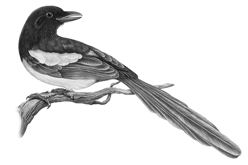
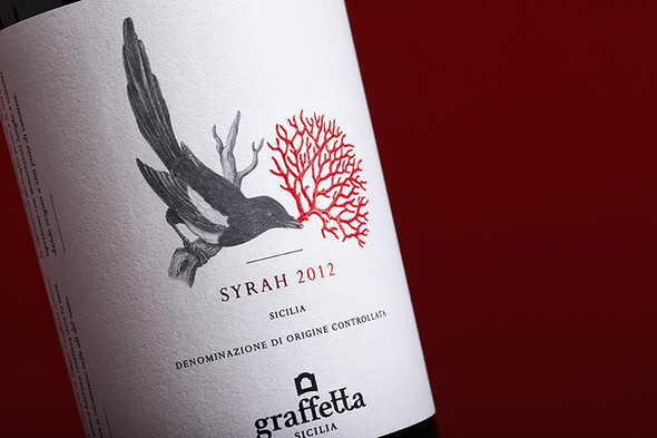
“In ancient times the Graffetta farmland, located in the splendid southernmost tip of Sicily, was a coral reef immersed in the best of the Mediterranean Sea. From this particular origin, imprinted in the DNA of the land, we have ‘seen’ the precious red coral, vibrant with life and sea, meet an inhabitant of the land and the wind, an inhabitant who by her very nature is able to recognise and love something of value: the magpie. So we see a unique encounter, able to break through the barriers of time and give these wines a high-impact visual identity.”
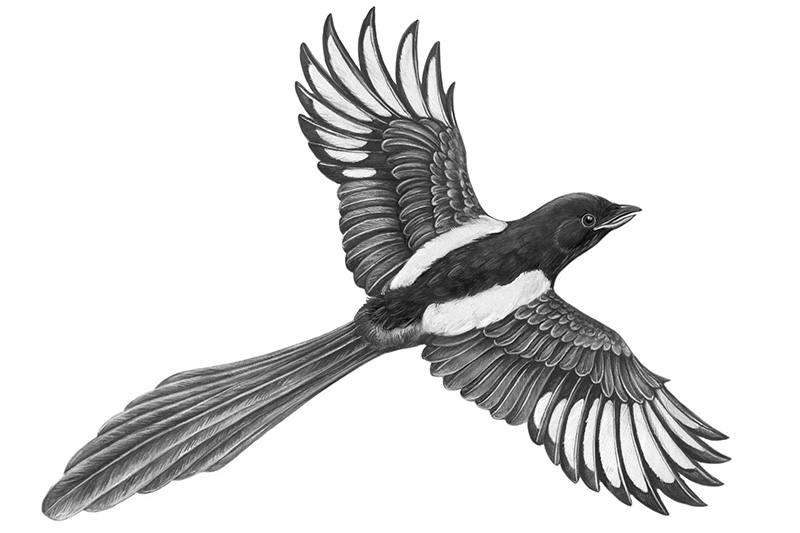
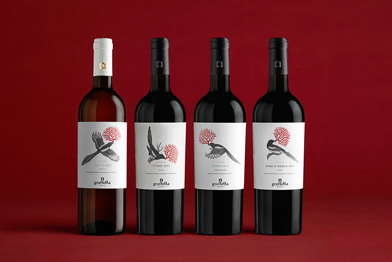
The bird and the coral are the focus of the clear labels. The whole magpie is delicately drawn, with fine lines and shading, which contrasts with the coral in the beak, printed with embossing ink to give body and three-dimensionality. This also strengthens the use of the classic colour combination (black & white and red), which does not make the different colours of the names appear disharmonious.
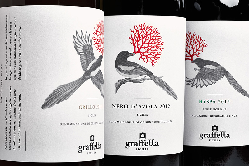
For me, the message transmitted by the labels also has another side. In folklore, the magpie is characterised as a bird who gathers bright, shiny objects (’treasure’). Jewellery is also made from coral, which can be found at Sicilian markets too. The vineyards are the nests which they enrich, thus the wine originating from there itself turns into treasure too. You can decide for yourself which train of thought you prefer – and you can do it with a glass of Nero d’Avola in your hand.
Designed by Neom and The Food Appeal