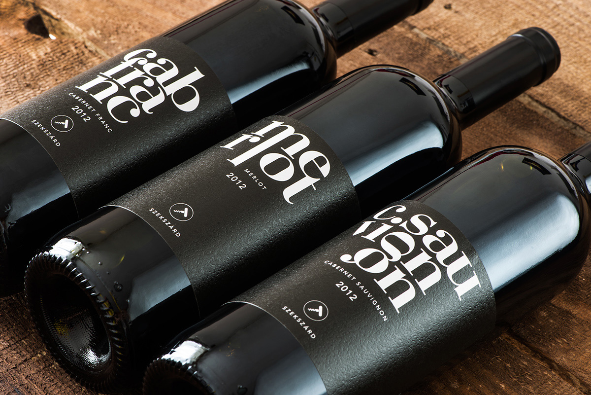
Many producers have used symbols about products’ material or guaranteed properties for quite some time. This achieves the aim of robing wines in a fresh and unique, but also fashionable and memorable way. The design of the logo and that small something that turns a brand into something more and makes it stand out from the sea of wine bottles in the shops is nothing other than fashion: the labelling. This small thing has become a determining factor and has been effectively used in a variety of product lines using colour coding.
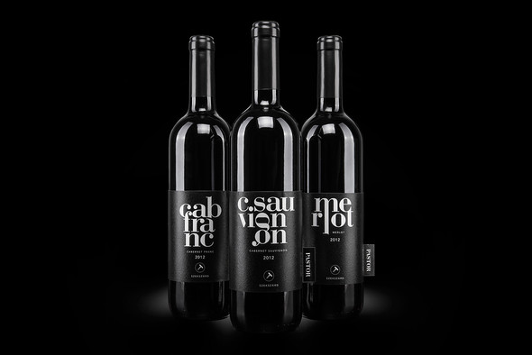
If that were not enough, the designer came up with wonderful typographical solutions and strengthened the line of the label further using symbols. It’s funny how the corkscrew which features on the cork closure version also appears crossed out on the screwtop version.
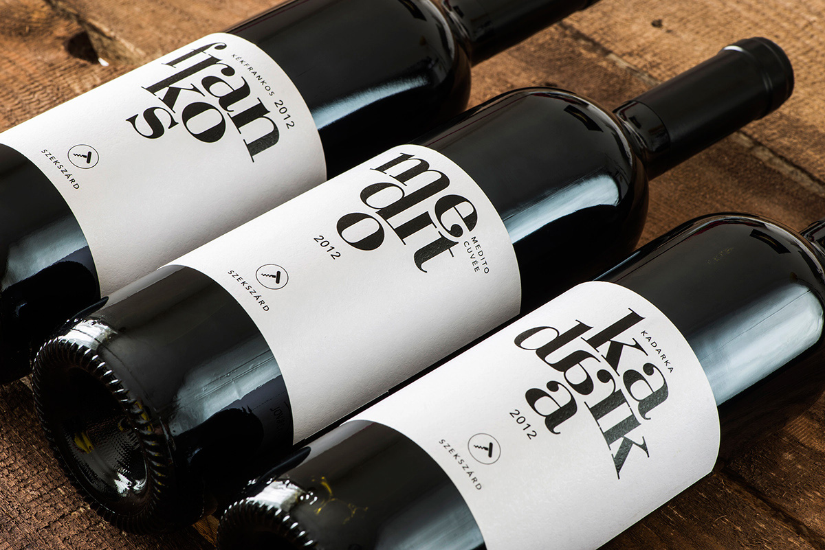
I wanted to create a graphic design where the words are shaping a bunch of grapes and the letters represent the pieces of grapes. - Miklós Kiss (designer)
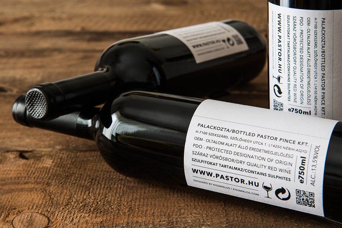
I particularly like the readability of the product description and the varied layout. Not to mention the fact that the text of the paper itself not only also lends a fine elegance to the labels, but thereby also makes the overall impression even more convincing.
It’s also worth mentioning that brand, thanks to its uniqueness, has also succeeded in conveying the winemaker’s international experience and philosophy.
Far from my home I realized, that this harmony, that I experienced abroad, can be found in the wines of Szekszárd as well, so I came back to my roots to find it. I would like to share the fiery, passion full yet bright, pure and honest wines with my customers, show the true traditions of Szekszárd with a youthful vibrancy of crafted natural wines. - Tibor Juhász (winemaker)
Photos by Bálint Jaksa
Designed by Miklós Kiss