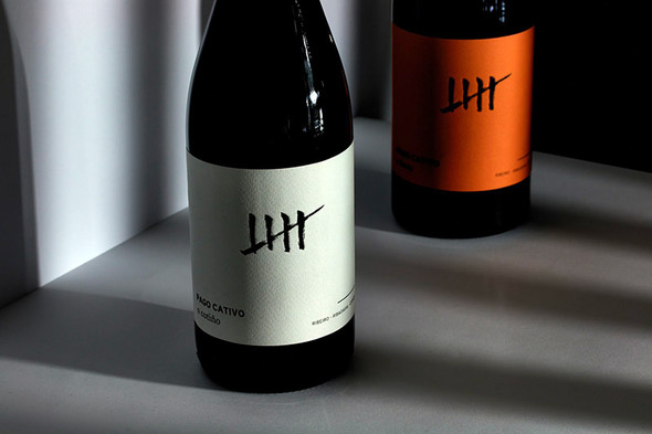
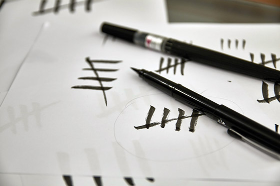
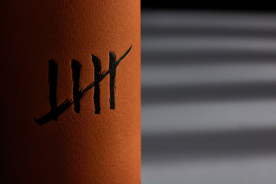
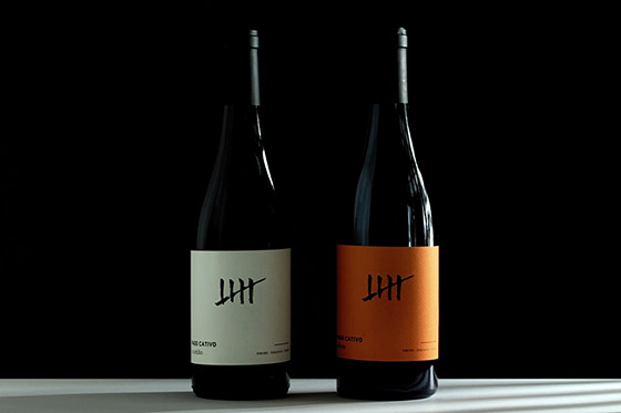
Simplicity and meaning define the image of Pago Cativo, a Spanish wine with two presentations: White O Forte and Red O Cotiño. Its iconic design plays with the product's name. "Cativo" means "small" in Galician, which is the region of the wine, but also "captive", so that's why one of the most emblematic elements of the prison was taken as the central image of this wine.
Finally, the design was stamped on white and orange labels to differentiate each type of wine and highlight the glass' color of each bottle. The paper used was Cotone Bianco Ultra WS de Manter.
Designed by Alex Monzó, Brandsummit
Via: Packaging of the World