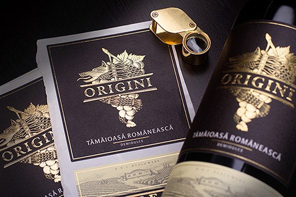
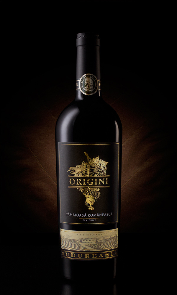
It is well known that black and gold together symbolise elegance and luxury. Numerous brands love to use these two colours on their image-related and various creative materials. Black is indisputably a cold, hard colour symbolising respect and power. Black has weight, character and interestingly enough, black makes things look smaller. When paired with black, all colours gain emphasis, becoming more elegant and attractive. This is well-represented by the Origini (Origins) range, too. However, there is more to the labels; namely the elaboration and history of the emblem.
The customer’s vineyards are situated close to an ancient Dacian archaeological site. This was the origin of the idea for the new exclusive product line to be a sort of homage to the Dacians and their heritage at the same time.
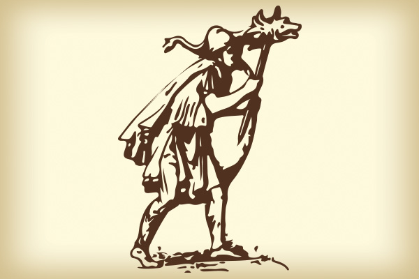
The ancient military symbol of Dacian people was Draco, the half wolf, half serpent ensign which would suffice alone on a label. However, the designer gave it a bit more thought and combined this with grapes. Let’s have a look at how the final emblem was born.
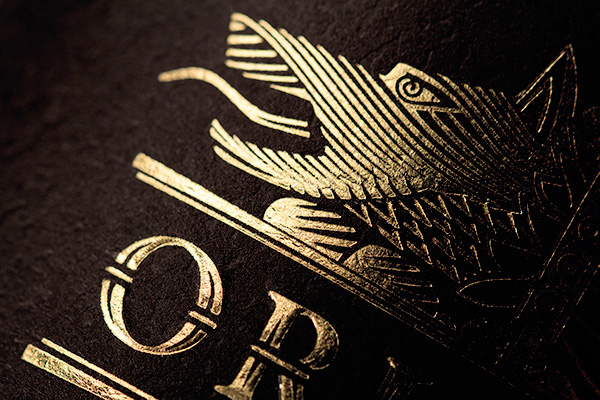
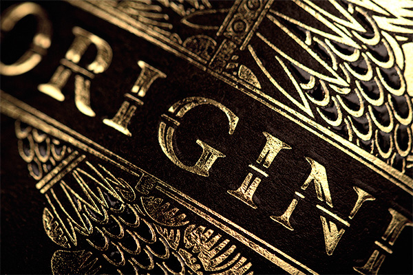
In the process of designing this label I've tried to put together a symbol relevant for Budureasca winery's ancestry and also make the grape and the Draco be a visual hint to Genesis and the forbidden fruit that brings all that knowledge and truth. After all, we don't say "In vino veritas" for nothing.
I would say that in addition to the perfect graphic design, this train of thought and the final result is what makes this label truly special. Well done.
Designed by Ion Barbu