Depicting the terroir on a packaging is not new-fangled but, luckily, year after year designers manage to come out with all the better ideas.
We decided to name the wine ‘Litos’, from the Latin word meaning ‘stone’ – a true expression of this beautiful land located in Apricena, in the region of Puglia, Italy. The wine – the fruit of these organically farmed vineyards – is completely natural and wonderfully expresses the characteristics of the rock layers in the subsoil.
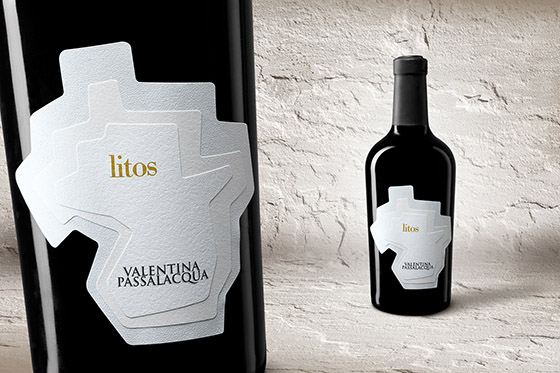
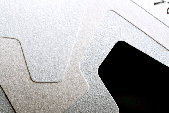
The rock layers are symbolized by three natural papers of different tinges. The designers have really carefully selected the paper taking into consideration that the winery is engaged in biodynamic viticulture so nature protection is important for them. This type of paper is composed of short vegetable fibres and is produced by screening these fibres out of a water suspension then mixing, pressing and drying them. Being a relatively quickly decaying material, organic paper is everywhere considered to be nature-friendly. Nevertheless not only the fans of organic wines can have appreciation for the packaging considering that it highlights the value of the product in a simple but purposeful way even beyond the visual concept.
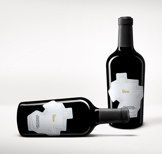
The uniqueness of the packaging, however became a problem to be solved and fit into the standardized production of the wine. Following several months of research and experimentation, this problem was solved in cooperation with Rotas (a labelling company). Because of the three layers, it certainly was not an easy task to guarantee that labels are identical on each bottle while keeping standardized production cost efficient. They did a nice job!
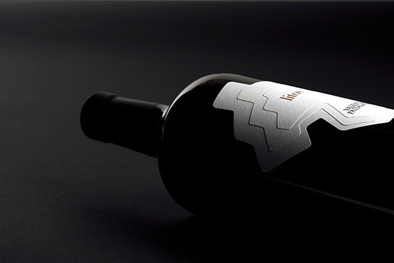
The “Litos” wine was awarded the Gold Medal at the 19th Vinitaly International Packaging Competition and at the 2015 San Francisco International Wine Competition also.
Designed by Spazio Di Paolo