Lechburg is the first biological company in the heart of Transylvania. All begins from an Italian family with the love for the wine. An adventure started in 1962 from generations of wine-makers and culminated implanting new vineyards in Lechinta, a spellbound land in the heart of Romania. We designed the new identity and the packaging for them, starting from that heart, indeed.
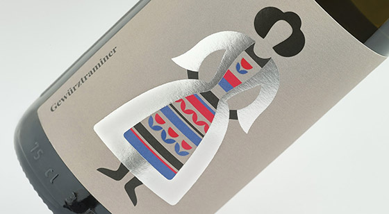
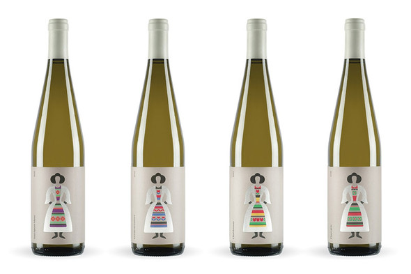
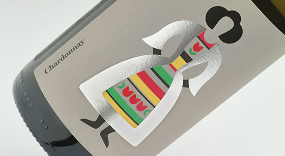
From the study of the traditions of this land full of stories and legends, we came to something that caught our attention: the traditional dresses full of happiness and colours that the Romanian people wear even today, during the ancient festivity, on February 24, when the field God of love and fertility it’s celebrated. We felt free to use the bright colors of the dresses to design the wine labels: contrasts, vivid colors, stripes, and floral patterns, highlighted with a silver foil that draws the silhouette of the women using clean and essential curves.
The logo recalls the tower with the clock of the Lechinta’s church: we used the line of the roof that has a pyramidal structure, to design it, making cuts to the letters in a full/empty composition, realizing an original lettering.
What's Unique?
The result is a wriggle of light on a background of Pantone Warm Grey 5U. The paper is a Fedrigoni Freelife Merida 120 gr.
Designed by nju: comunicazione
Via: Packaging of the World