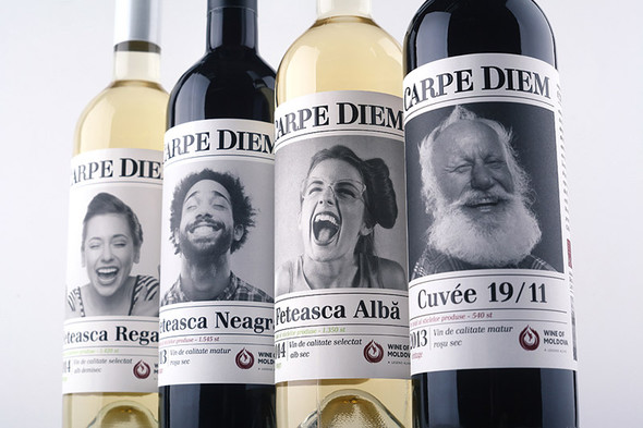
Studio 43’oz and a famous Moldavian wine room “Carpe Diem” present unique and a same-name wine “Carpe Diem” (lat. – seize the moment)
The target audience of this product became young people who lead an active lifestyle, trendmakers, those who lives a full life. The customer and the wine author itself was ready for a new, creative approach for a product design, and the client addressed several agencies before settling upon a concept offered by our studio.
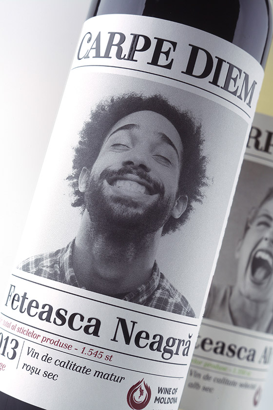
Special thing about the design of “Carpe Diem” wine is that it’s not created by traditional stereotyped solutions that are usually used for wine labels. At the heart of a design there is expression and emotions which are more important in RTB-factor for chosen target audience. At the label that surrounds bottle for 360° there are shown people faces like the best emotional indicators. In spite of non-traditional (for market) design stylistics the product looks smoothly on a wine shelf. Label is the base of consumer communication. It is something new on a market and will definitely stand out on a shelf with classic wine.
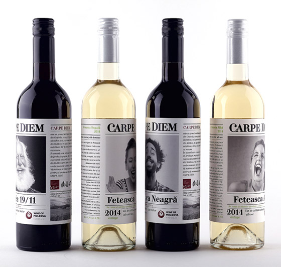
As a result the appearance meets declared requirements - the design conveys disposition and temper that was enclosed in a process of wine creation and the philosophy of its (wine) author. The “Carpe Diem” wine is presented in 4 SKU’s and can already be found in a same-named wine store. The wine Carpe Diem Feteasca Neagra was awarded a gold medal in a European contest ProWein 2015.
Designed by Dmitriy Ivanchenko (43'oz Agency)
Via: Packaging of the World