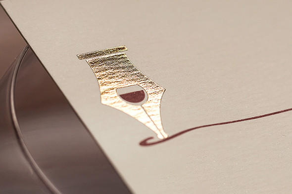
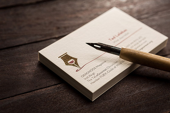
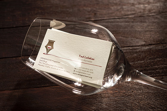
Most probably you know the game when a job must be guessed that someone mimes or describes. When I saw the logo for the first time, I was really pleased as this is a perfect example of ‘less is more’ (Ludwig Mies van der Rohe). Had I not known Ted’s activity, it would still be obvious what the union of a glass of wine and a pen means.
As Humberto Maturana, biologist put it, we human beings refer to our aesthetic experiences (sounds, colours, smells, feelings) as we find ourselves in coherence with some particular aspect of our domain of existence (workplace-work relations, home-family). Art connects us with our various social roles.
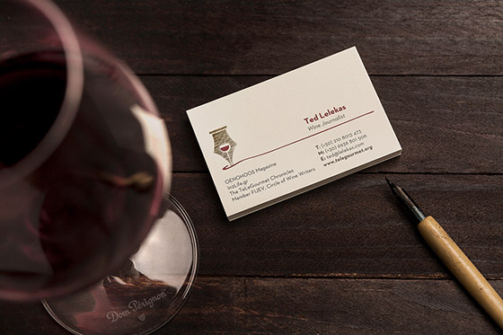
According to Dieter Rams, good design is as little design as possible. He also differentiates between the above-mentioned ‘Less is more’ slogan and his idea of ‘Less, but better’. I think the visual identity complies with both approaches as it has no unnecessary functions at all; it is aesthetical, straightforward, modest, frank, timeless and as little as possible. Nice work.
Photos by George Pavlakos
Designed by Sophia Georgopoulou