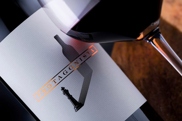
Going from a Maze to an Amazing Wine Label Design
This project started off well ahead of its completion. I knew I had to design a label for a limited edition of 300 bottles and this boosted my creativity. Still, it was all a maze. The people behind the project were two wine bloggers who were doing something way outside the box. In order to learn more about wine, they decided to go all in. They rented two rows of vines from a winery and dedicated a year to taking care of them. Then, they moved to the winery and carried out all the vinification practices. They waited for another year for the wine to age in a barrel and six more months for it to age in bottle. Exercising supreme patience they tackled all the challenges of packaging, promotion and selling. The idea was to replicate all the decisions, emotions and concerns that real wineries go through from the vine to the bottle in the hands of a [hopefully] happy customer. They filmed the entire process in a miniseries with the wine as the main character. Therefore, we had to look for a truly amazing wine label design at a budget and I had to keep the premium wines segment in mind.
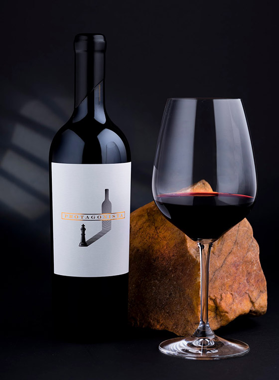
The only thing we had settled on from the start was the name “Protagonista” and a brief that said (and I quote):
Protagonista is the main character in a story. In our story, this character must be a truly great wine – complex, authentic and perfectly flawed. The Protagonista must be strong and sensitive at the same time. This needs to be finished off with an amazing wine label design, which is why we are writing this to you! In other words, we want Hamlet and Batman combined. Good luck and don’t you ever say we didn’t know what we wanted!
Why would I say that? I think this wine label says it all. Wine is king! There you have it: Protagonista!
Designed by the Labelmaker
Via: Packaging of the World