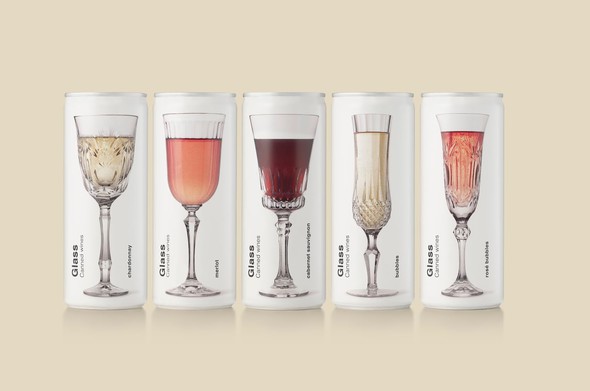
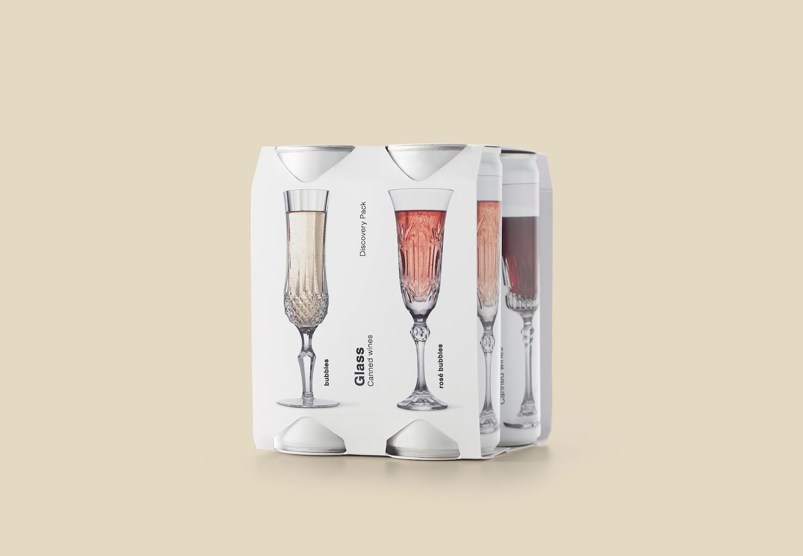
The product is also aimed at the Spanish market but since consumers are not educated in this type of format, one of the handicaps we had was to convey that the can contained wine and not an isotonic drink. We had to express clearly and directly that it is a wine.
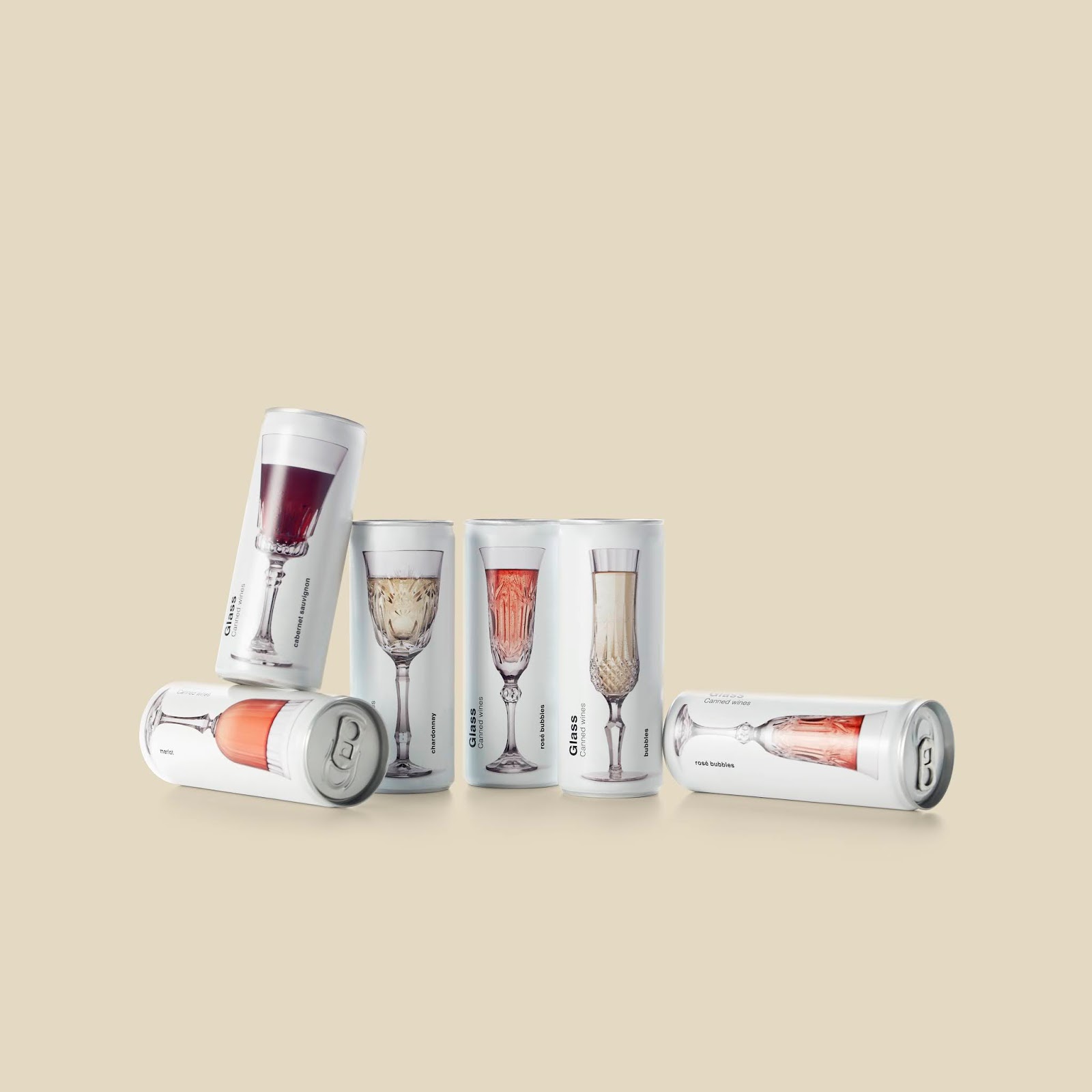
So the design concept revolves around highlighting a traditional product in a current format. The content of the can is two glasses, then we decided to represent one glass. With the crystal glasses we wanted to raise the qualitative perception of the product and that these were the protagonists of the design. Cut glass goblets, like Grandma's, give it a vintage look that breaks with the white background and modern format. In addition, by representing different types of glasses, we help the consumer to differentiate the different varieties of wines that make up the range. For this design we wanted the typography not to take on relevance in the whole, so we opted for a Helvetica. This typeface gives it simplicity and timelessness.
Designed by Puigdemont Roca
Via: Packaging of the World