CONTEXT
Framingham is a highly regarded vineyard known for delivering quality sustainable and organic wines. They pride themselves on being bold and original, combining tradition and innovation to create wines that traditional Marlborough vineyards wouldn't dare.
The F Series is the winery's depth dive into their experimental nature. A chance to unleash and produce high quality artisanal wines that satisfy the winemakers themselves, without apology. Every varietal is short-run only and strictly limited edition - when it's gone it's gone.
Our brief was to give these distinctive wines the design and identity they merited, while staying true to the Framingham masterbrand.
APPROACH
Less was most definitely more. Because we were dealing with wines of such bold flavours and aromas, we decided to go minimalist - and let the wine speak for itself.
EXECUTION
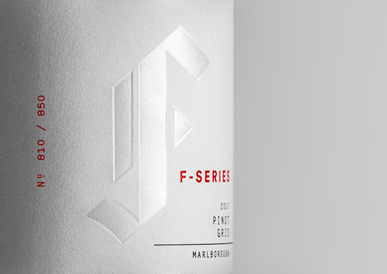
Everything about our design suggests high quality and limited edition.
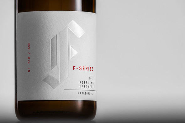
Every varietal looks identical except for the name and edition number stamp. We use a simple white base label which heroes the iconic Framingham 'F' logo - beautifully printed with white foil on uncoated white stock. The only colour - in primary red - is the stamped edition number and the bold F Series wordmark.
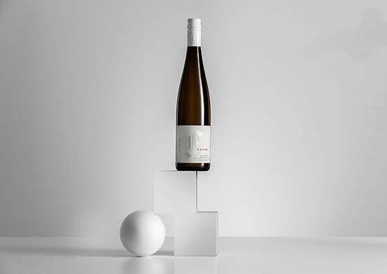
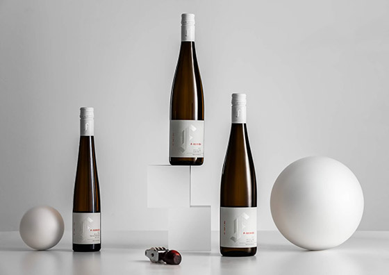
For photography we also shot the bottle white on white - with primary shapes that reference balance and experimentation in homage to the wines' creation. In conclusion, a hallmark of quality, and a triumph of confident understatement that pays tribute to the people who create these distinctive, innovative and exclusive wines.
Designed by Milk Brand Agency
Via: Packaging of the World