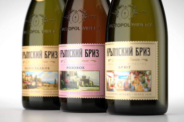
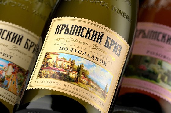
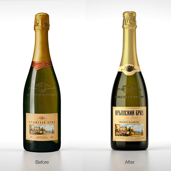
Solution. The line “Crymskiy Briz” (“Crimean Breeze”) is well known at the market and the question about its redesign was put quite long ago. Old design has been familiar to the customer, so it was important to “refresh” the label as gently as possible. We kept common concept, but revised printed content, highlighted key points, gilded it with gold and tactile varnish. All this resulted in sunny and elegant, but at the same time light label, as light as Crimean breeze.
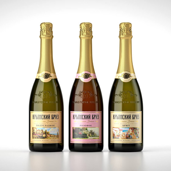
Designed by Brandmeisters
Via: Packaging of the World