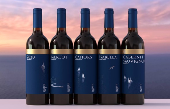
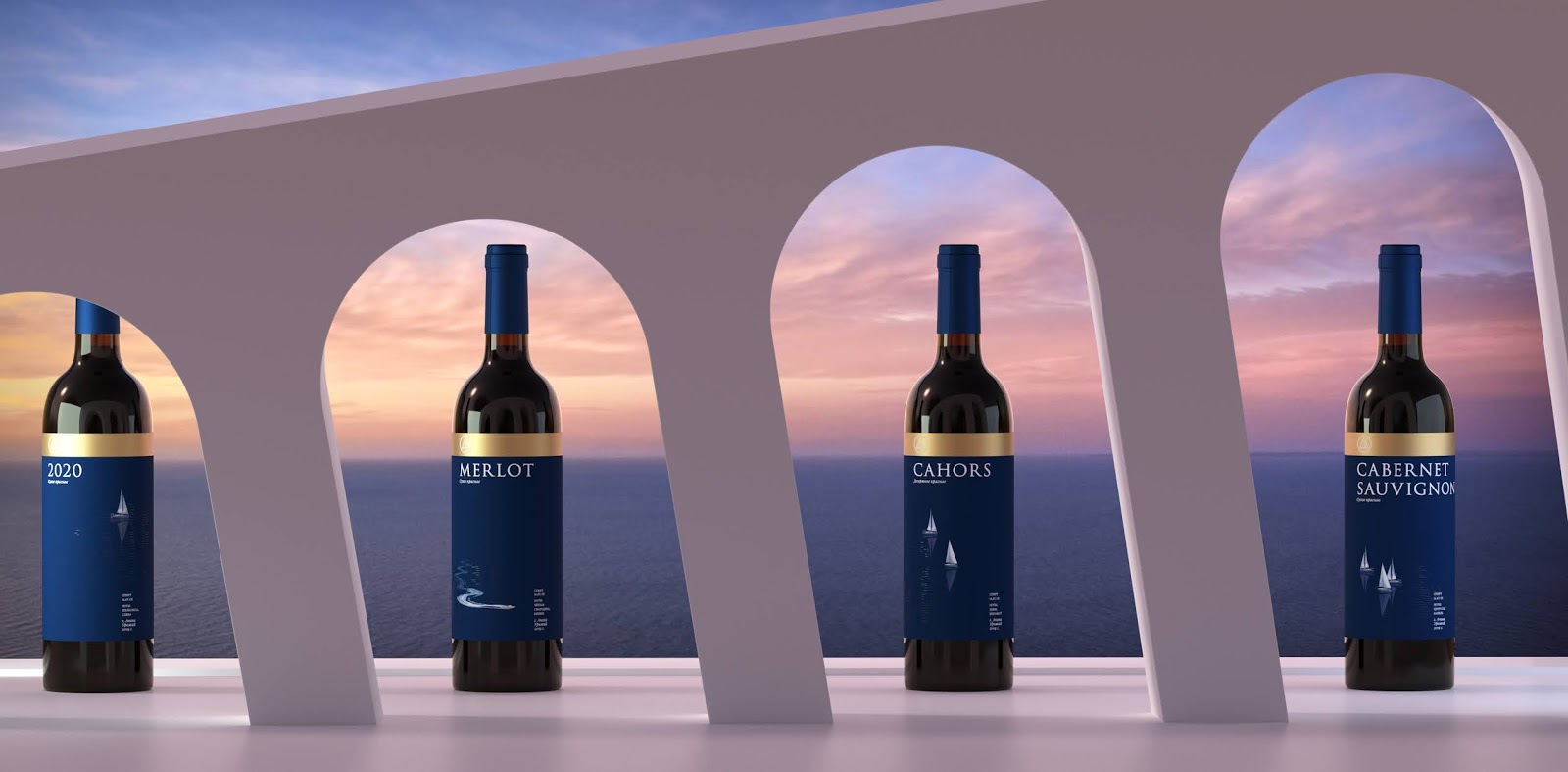
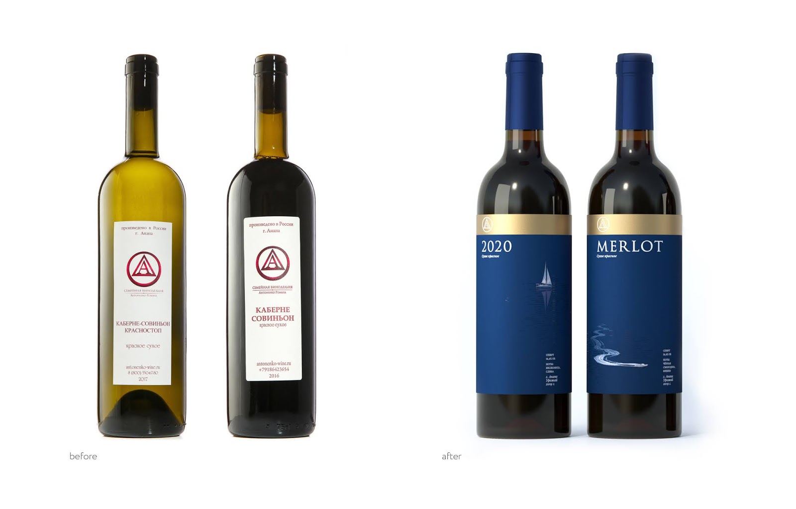
The chosen design concept is based on concise illustrations associated with holidays on the Black Sea. “Yachts and motorboats, dolphins and seagulls – you look at the labels and immediately start singing in your head some romantic song about a vacation, for example, the song of Valentin Strykalo “A yacht, a sail and just the two of us in the whole world”, says Anna Rufova, the art director of the project.
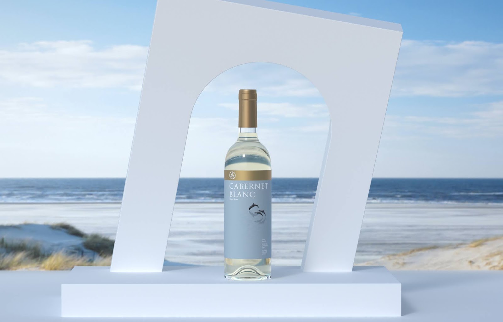
The color palette chosen for the labels is designed to reflect the richness, tartness and depth of flavors that are characteristic for most wines of this family winery. And the use of such a post-printing effect as three-dimensional varnish (to highlight the winery’s logo and some elements of the illustrations) emphasizes the attention of the winemakers to detail.
Customers can already order Roman Antonenko wines in the Ohmybrand design on the website of the winery or buy them in the company store in Anapa — for themselves, as a souvenir from a wonderful vacation in the Krasnodar Region or as a gift to their loved ones. The first buyers point out that the label design has played an important role in their purchase decision. In the near future Roman Antonenko winery is planning to distribute their wines through local wine networks.
Designed by Ohmybrand
Via: Packaging of the World